Designing an intuitive Air Quality UI
AIR+HeALTH app & UI
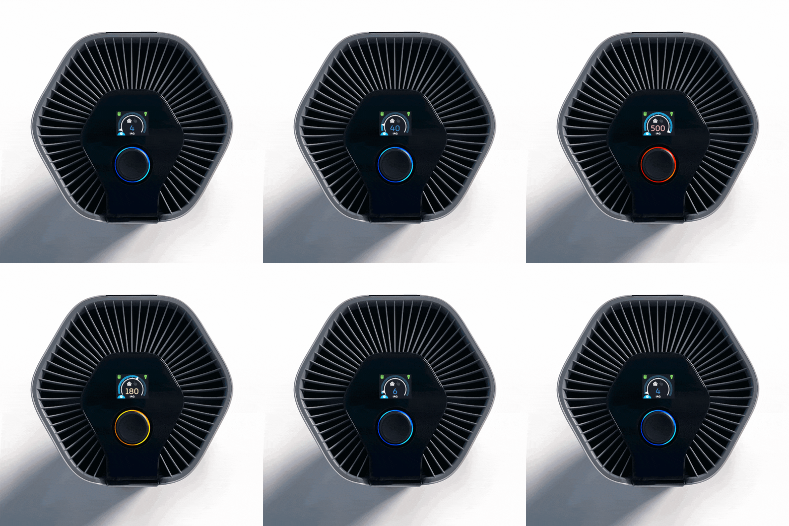
Air+Health produces a variety of home and office air purification solutions. The brand wanted to release a new, portable air purifier that rivaled competitors like Molekule. Along with the physical design of the product being developed simultaneously, designing the onboard and app UI was a unique challenge in itself. The onboard UI would be controlled with a dial component and (as requested) have little to no words.
How could we create an intuitive onboard experience that uses only visuals and an app that incorporates the onboard design in a seamless way?
UI/UX Design
〰️
User Journey
〰️
Wireframing
〰️
ENG Handoff
〰️
UI/UX Design 〰️ User Journey 〰️ Wireframing 〰️ ENG Handoff 〰️
Target Audience and User Interface
Much of the research of this project was informed by the industrial design of the product. The client wanted to appeal to a wide variety of health-conscious and busy audiences. For the sake of clarity, we focused on a few proto-personas to guide our decisions; the health-conscious elderly, and adult millennials with busy schedules. We hypothesized that the high-end value and portable nature of the device would connect well with these audiences because they would be looking for user-friendly, no-fuss air purifier solutions.
Once the components of the product were set, we determined that the onboard UI would feature a tactile dial interaction that could turn and click. In the early stages, the onboard screen dimensions were not set so we sketched concepts for different screen sizes and shapes. The UI would feature content such as an air quality level indicator, fan level dial/slider, settings, fan modes (manual and smart modes), filter life indicators, and lamp life indicators.
Onboard UI: Wireframes
In the wireframes stage of this project, we focused on a few goals:
Create a quick way for the user to interact with the device and change fan levels/settings.
Optimizing the fan modes experience and what that means for the UI.
Create a simple user flow to access settings.
Prioritize visuals to maximize real estate and keep the UI simple.
App UI: Wireframes
We completed 3-4 iterations of the app wireframes and mockups to ensure that they aligned with the functionality of the onboard UI. The app features the same air quality indicator (and fan level “speedometer”) as the onboard, additional buttons to favorite specific fan settings, child lock options, schedules follow, device select, and history/reports screens.
We created two color schemes for the air quality scale to ensure legibility on the device screen (black) and the app screens. When delivering the assets for development, we included a final user flow map with annotations specifying text styles, colors, and brand standards.
Final Thoughts
This project was exciting and insightful; I learned that UI elements must be versatile and universal so that they can be applicable to multiple platforms. Creating the onboard air quality indicator required a modular design that could fit into the app design appropriately. Given more time, I would have loved to develop a dark mode palette for the app and complete usability testing.


