Crossrope Help Center
Improving the help user flow
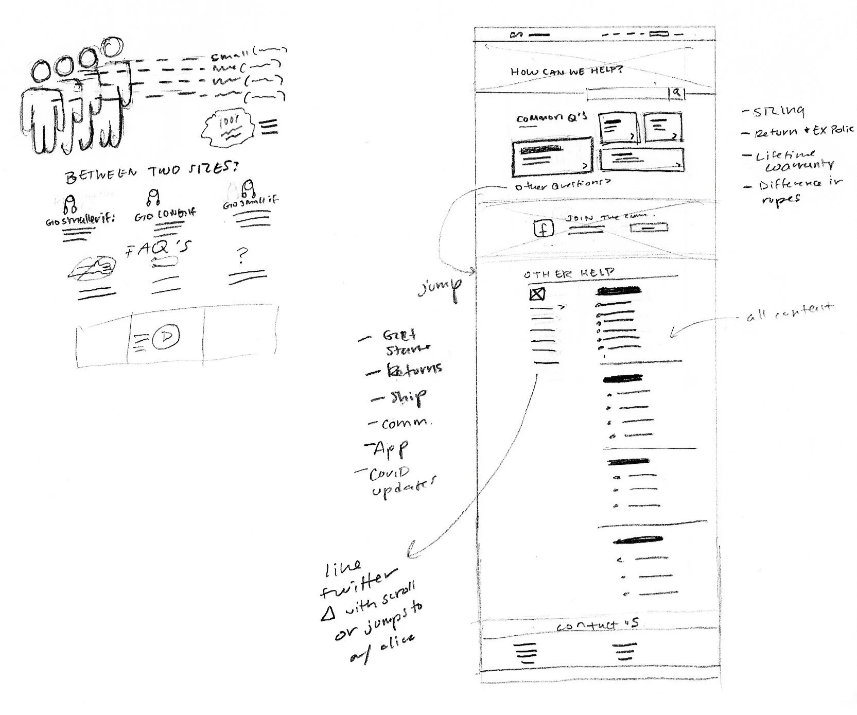
Crossrope is a jump rope and fitness brand that focuses on creating quality and versatile jump ropes and workouts that customers can do anywhere. Crossrope requested some ideation for their help center user experience. The original design is plain and requires too many clicks to reach answers. The new layout prioritizes information for the user while simplifying the user experience to fewer clicks.
Roles:
UI/UX Design
Information Architecture
Wireframes
Mockups
Competitor Analysis
Icon Design
Information Graphics
Prioritizing Content
After taking a content audit, we determined four topics that were of high priority to Crossrope users:
Jump rope sizing
2020 & 2019 handles comparison/questions
Exchange & return policy
Lifetime warranty information
The “Common Questions” section offers four interactive blocks that link users to information pages and graphics, with icons and subtext to tell users if the sub-page is an article or graphic. This design is advantageous because it minimizes visual pollution and clarifies the user's destination.
The old design is wordy and leaves users feeling lost in a sea of possible links to follow. The original landing page does have categories of content but they all link to long lists of articles and require several clicks which results in a high bounce rate (more users abandoning the site instead of getting answers).
Our new design encourages users to stay longer. If the “Common Questions” section doesn’t fit their needs, users can continue down the same page to find an accordion of categorized FAQs. Now, users can land on the help page, find their questions, and click once to get answers.
In comparison, the new sub-pages have a more exciting/branded feel and feature easier ways to backtrack, explore, and visualize the information. Based on client feedback, we developed an infographic design that used jump ropes to show different rope lengths. We also created several custom icons for the design.
Final Thoughts
This project timeline was fast and it required us to jump straight into high-fidelity mockups to showcase our ideas for infographics and styling. If we were to continue the project, I would love to design more sub-pages and see this project live to gather insights about whether this design improved the user experience. Regardless, the new design is an improvement and features a clear hierarchy of user goals from quick-access FAQs and scannable categories, to clear CTAs.


