Improving upgrades & plan comparison
Plans Page Redesign
Greenlight is a family banking app & debit card for kids. It offers simple savings and earnings features that teach financial responsibility.
Greenlight had growing plans to choose from with features ranging from debit cards and investing, all the way to safety features for the entire family. I redesigned the in-app plans page, with my PM partners, to scale for additional plans, increase upgrades, and improve the comparison experience.
Usability Testing
〰️
Discovery
〰️
Visual Design
〰️
Market Analysis
〰️
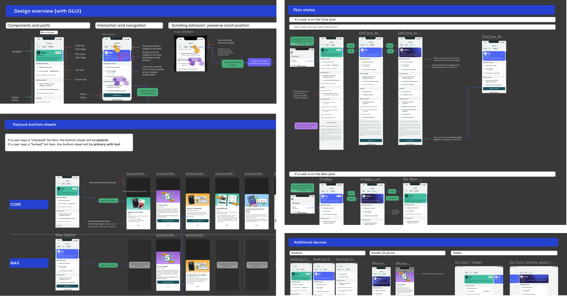
ENG Handoff
〰️
Usability Testing 〰️ Discovery 〰️ Visual Design 〰️ Market Analysis 〰️ ENG Handoff 〰️
My role
Lead DesignerTimeline
8 months (Design & ship)Tools
FigmaUsertesting.comGoogle docsConfluenceJiraTeam
1 Product Manager 1 Engineering Manager2 Front-end Engineers 3 Back-end Engineers1 Product DesignerProcess overview
The existing plans page design didn’t drive conversion & wasn’t scalable.
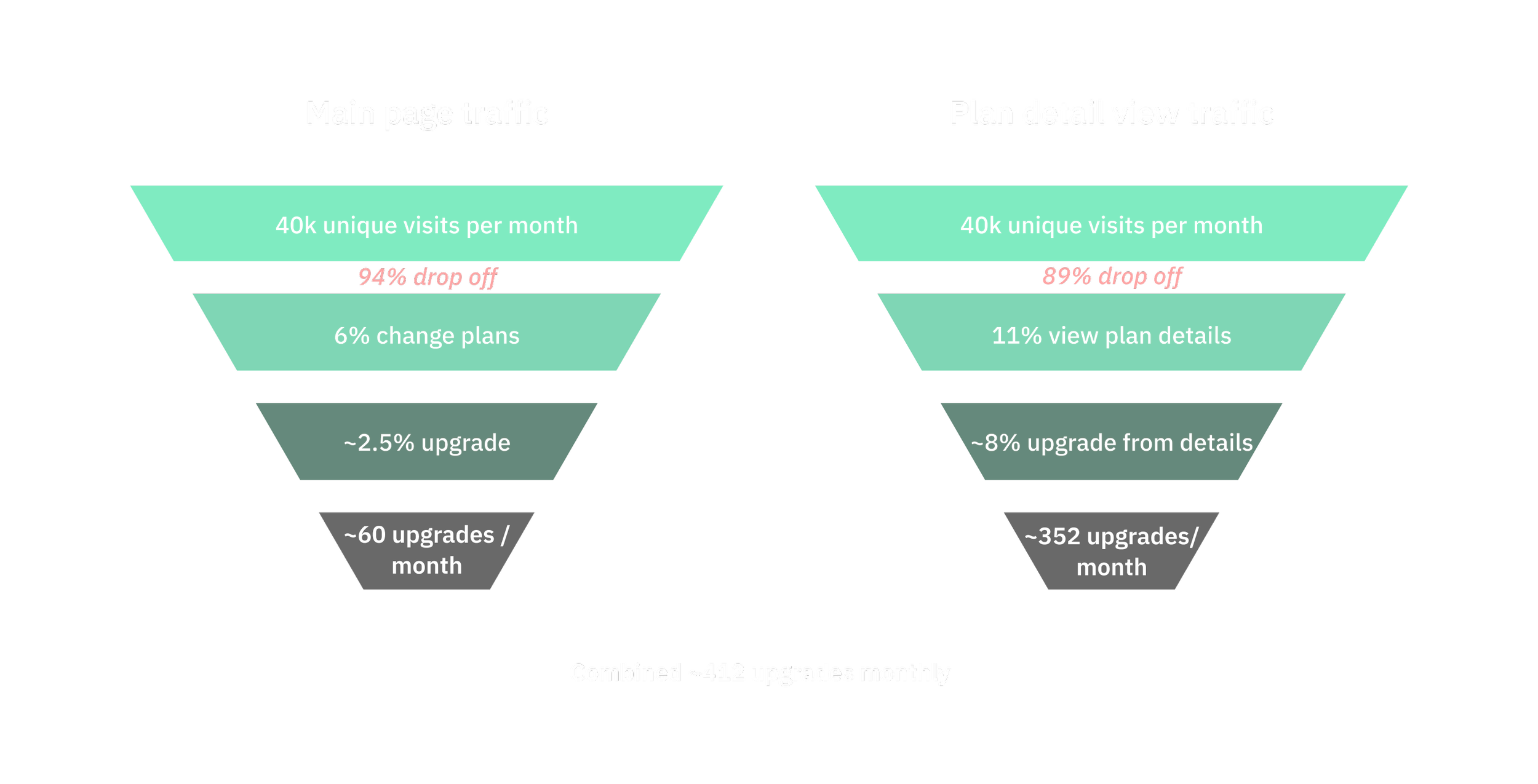
With the existing design, only ~6% of customers changed a plan, only 2.5% of those were upgrades. With 40k unique visits a month, there were potentially thousands of upgrade opportunities missed.
Additionally, the segmented control at the top and card design didn’t allow for growing plans and features.
How might we…
improve the plans page to optimize for upgrades* while also making plan comparison and discovery delightful?
*Challenge: Balance business revenue goals with user needs by providing transparency and value.
Discovery
-
There were three main use cases for this project and because it was in-app, anyone who had access to the plans page was already in a Greenlight trial or actively paying for a plan. Customers were either: trying to learn more about their plan, considering upgrading, or considering a downgrade.
-
At the time, the plans page got 40k unique visits per month. Only ~6% made a plan change, which were equally split between upgrades and downgrades.
Also, ~11% of traffic would tap to view the details of a plan on a separate page. Out of that group, 8% upgraded their plan. I hypothesized that plan and feature information was key to helping users desire to upgrade.
-
I had existing knowledge from pervious user research that users who were registering with a trial plan sometimes did not know what their plan included or its price. So, I prioritized clarifying both of these in the design.
Conversion data
We found that while only 11% of visitors viewed plan details, a higher percentage of them decided to upgrade.
Based on this data, we hypothesized that access to feature details leads to increased perception of value and increases the rate of upgrades.
Design Tenets
Ideation
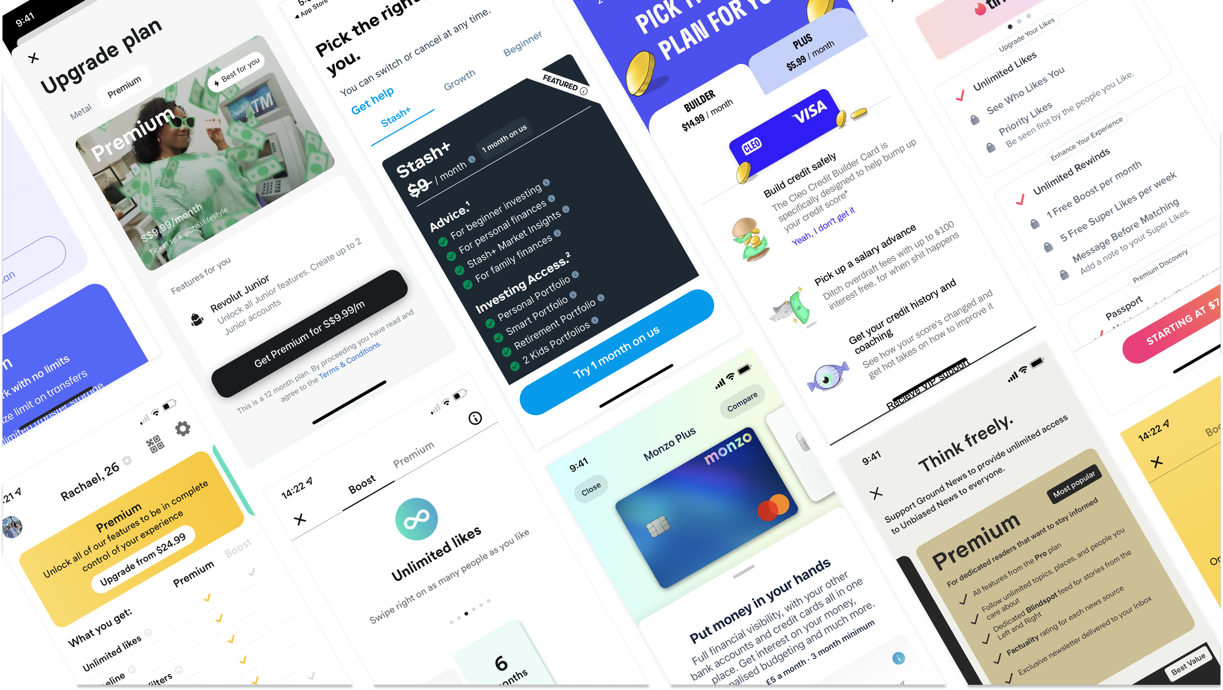
After auditing various interaction patterns across similar industries and digital products, I had enough information to explore low-fidelity designs. I generated several lo-fi wireframes to compare and contrast different layouts, lists, and feature detail views. From this exploration, I learned that tabs or a navigation that highlights how many plans we have (in addition to larger cards or a carousel) would increase higher plan awareness.
User testing
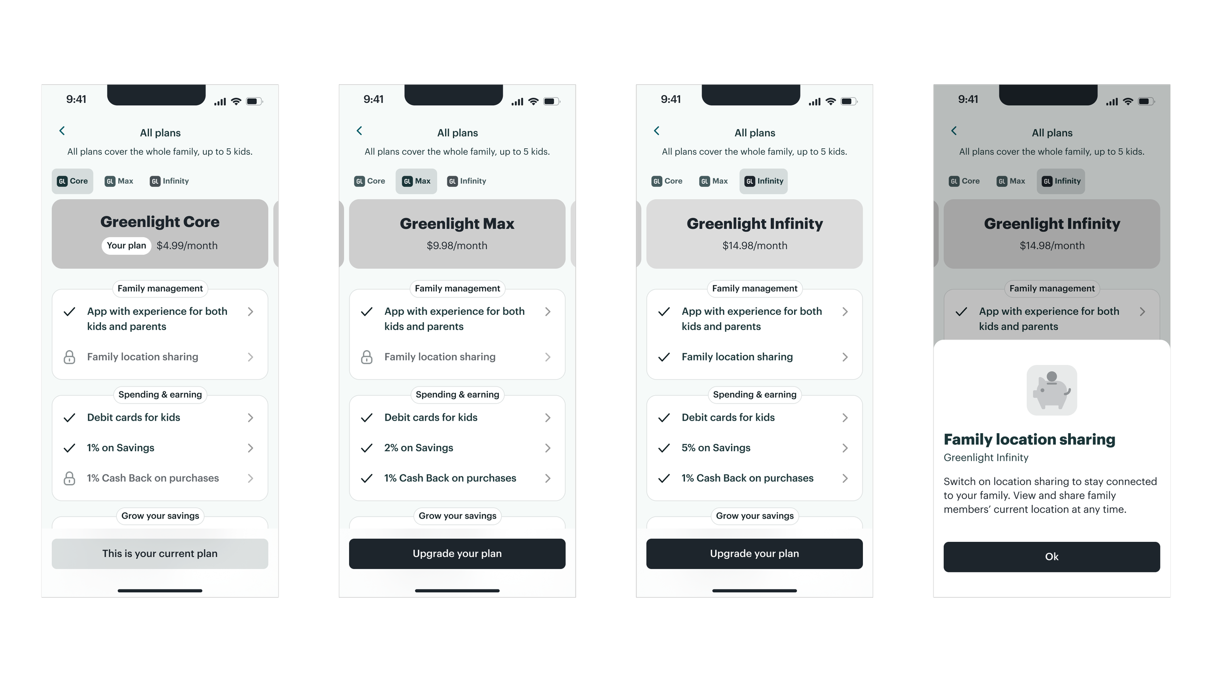
What did current users want to know when comparing plans? And what elements made that easier for them? I conducted unmoderated usability tests with 8 existing customers to learn more. I showed each user three different designs (each saw them in a different order to avoid bias).
A few elements were important to users: easily seeing which plan is your current one, easily comparing those features to that of other plans, and understanding specific details about each feature like privacy policies and terms.
User testing feedback
Worked well:
Grouping features into categories
Showing what is and isn’t included
Giving easy access to feature details via bottom sheets
Didn’t work:
Comparison charts added cognitive load
Too many details in the 1st and 2nd options
Users wanted to be able to compare all plans at once
Users preferred the tabbed design because it provided feature categories, access to details, and a simple way to compare features.
High Fidelity Designs
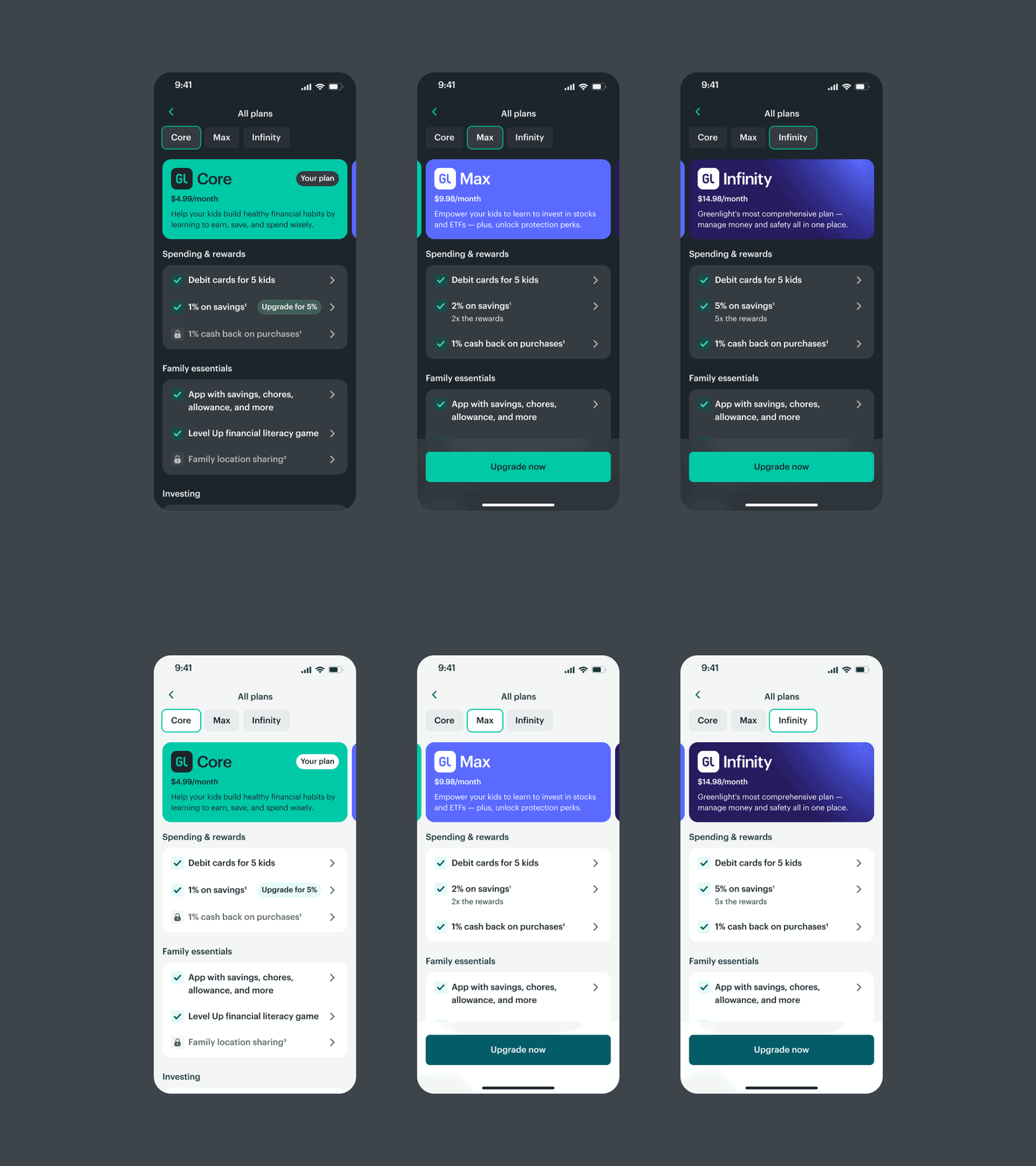
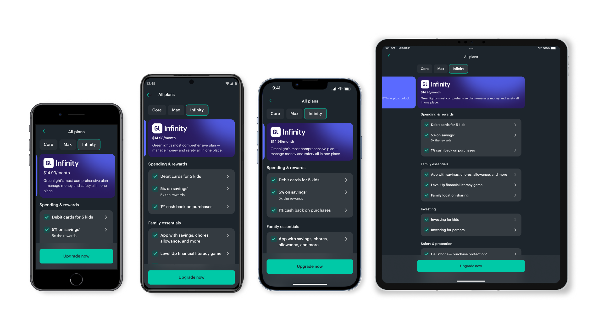
With a successful interaction pattern established, I turned my focus to copy writing and ways to categorize features. I landed on grouping features that aligned with the main pillars of Greenlight’s business; “Spending & Rewards”, “Family Essentials”, “Investing”, and “Safety & Protection”. This also grouped features according to the key value or service they provided, making it easier to understand.
Low barrier to upgrading
In usability testing, users highlighted the importance of feature descriptions when considering upgrades, specifically how features would benefit their family. Bottom sheets effectively allowed users to tap on a feature for quick details. Tapping a "locked" feature also linked directly to the relevant higher-tier plan, creating a clear upgrade path.
Deliver
Impact
This project was a huge win! The growth team often tested smaller changes to the plans page to drive conversion but it was rare for one to have such an impact. This work increased my product partners' trust in our design process and garnered support for more significant, user-centric design transformations.
Business
113+ net upgrades (+16%) over the control.
Flexibility for future copy testing.
User Experience
Flexible scalability for future plans and features.
Clearer plan value props and transparency.
Easy comparison experience.


