Intuitive Medical Device Design
Streamlining an outdated medical device UI/UX
Overview/background
A client approached our team at Laut Design with an innovative, noninvasive therapy device for psychiatric disorders. The device used electrical stimulation to activate mood receptors in the brain, offering long-lasting relief to patients.
Goal
Modernize the touchscreen user interface, improve the prescriber/technician experience, and streamline the information architecture.
Discovery
〰️
Information Architecture
〰️
Design System Creation
〰️
User Flows
〰️
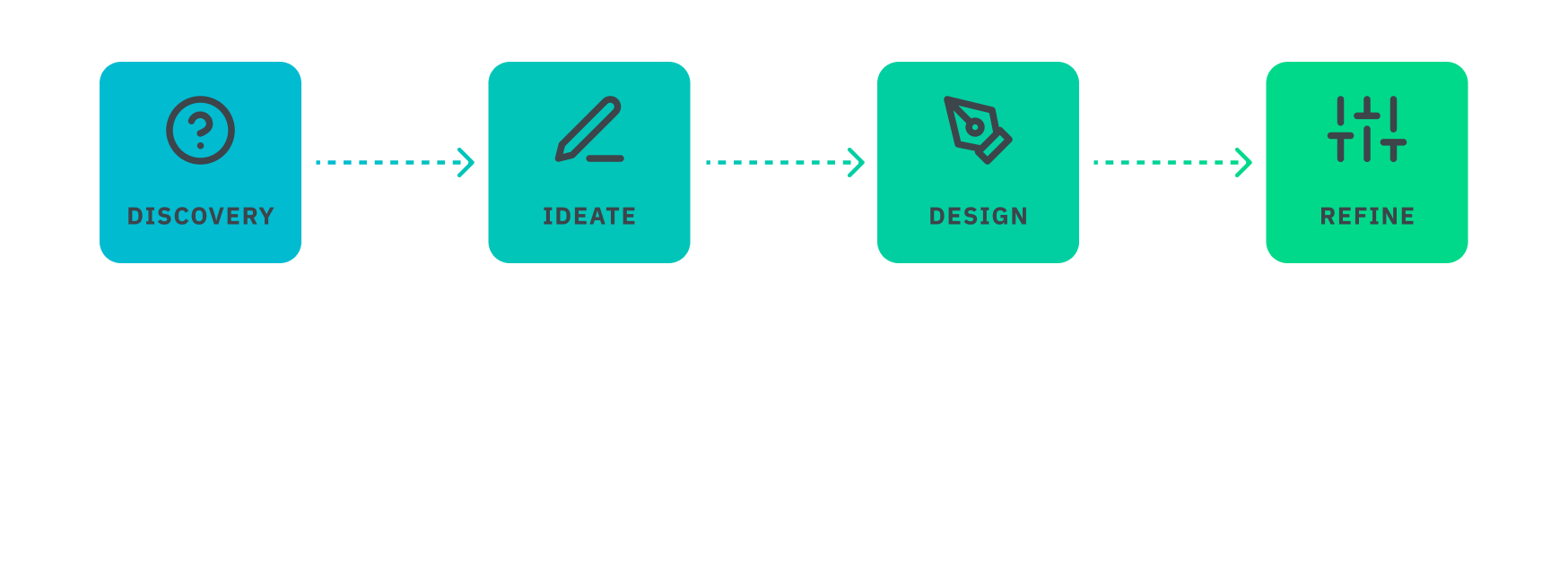
Discovery 〰️ Information Architecture 〰️ Design System Creation 〰️ User Flows 〰️
My Role
UX/UI designer (Research, Ideation, Design)Timeline
2-3 MonthsTools
Adobe IllustratorAdobe XD & FigmaGoogle MeetAcrobatTeam
1 Creative Director1 UI/UX Designer4 Client StakeholdersProcess Overview
Discovery Phase
Legacy User Interface
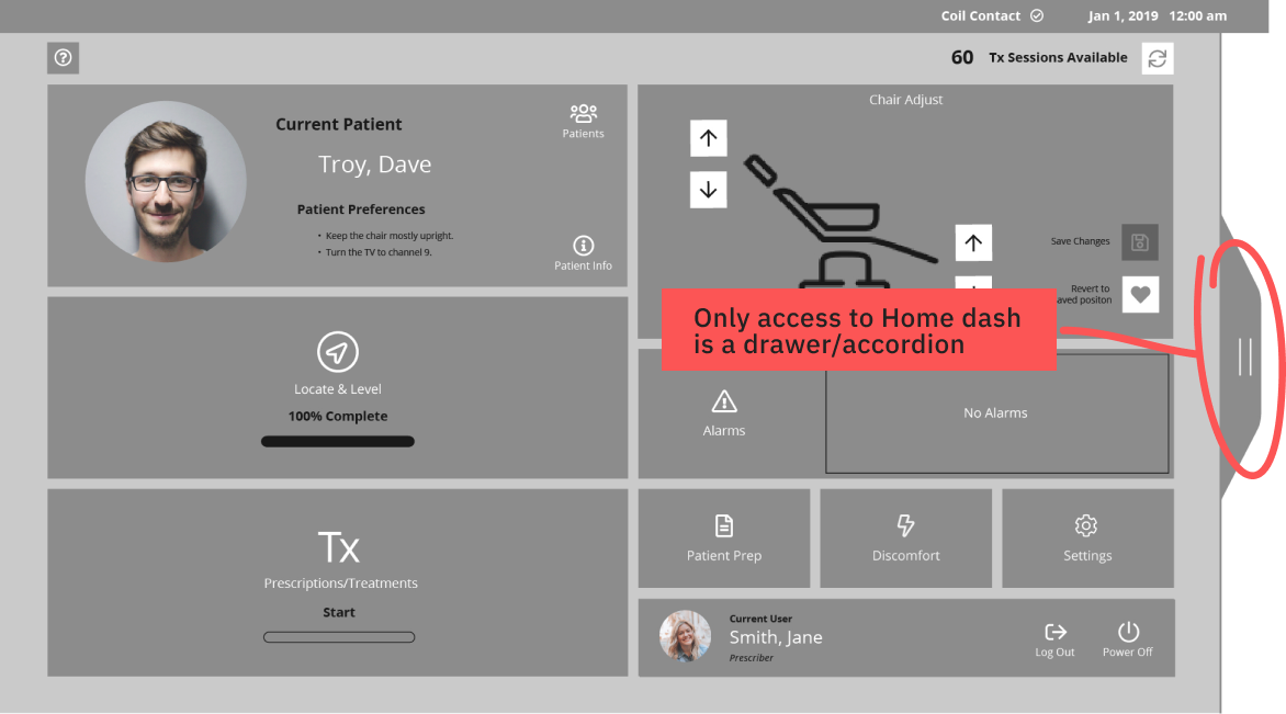
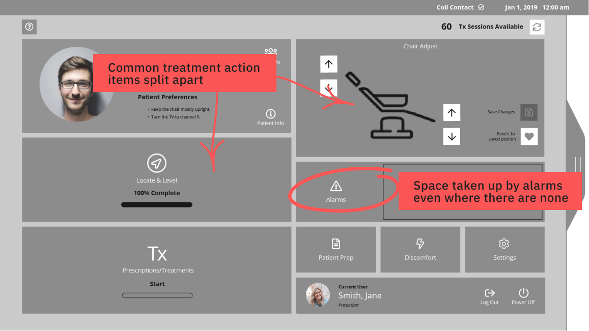
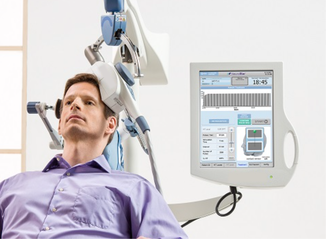
The legacy design featured bottom tabs for navigation between the "MT Locate", "MT Level", patient ID, settings, and end session screens. The screen layout and controls were also not intuitive. Parts of the interface were very crowded with controls while others were sparse, making it challenging to interact via touch.
Binary settings, like switching modes, were displayed via separate buttons rather than toggles or drop-downs. However, studying the existing interface, as well as the user manual, did show that certain controls were only relevant during treatment. In contrast, others could be accessed at any time (like chair adjustments).
Current experience audit
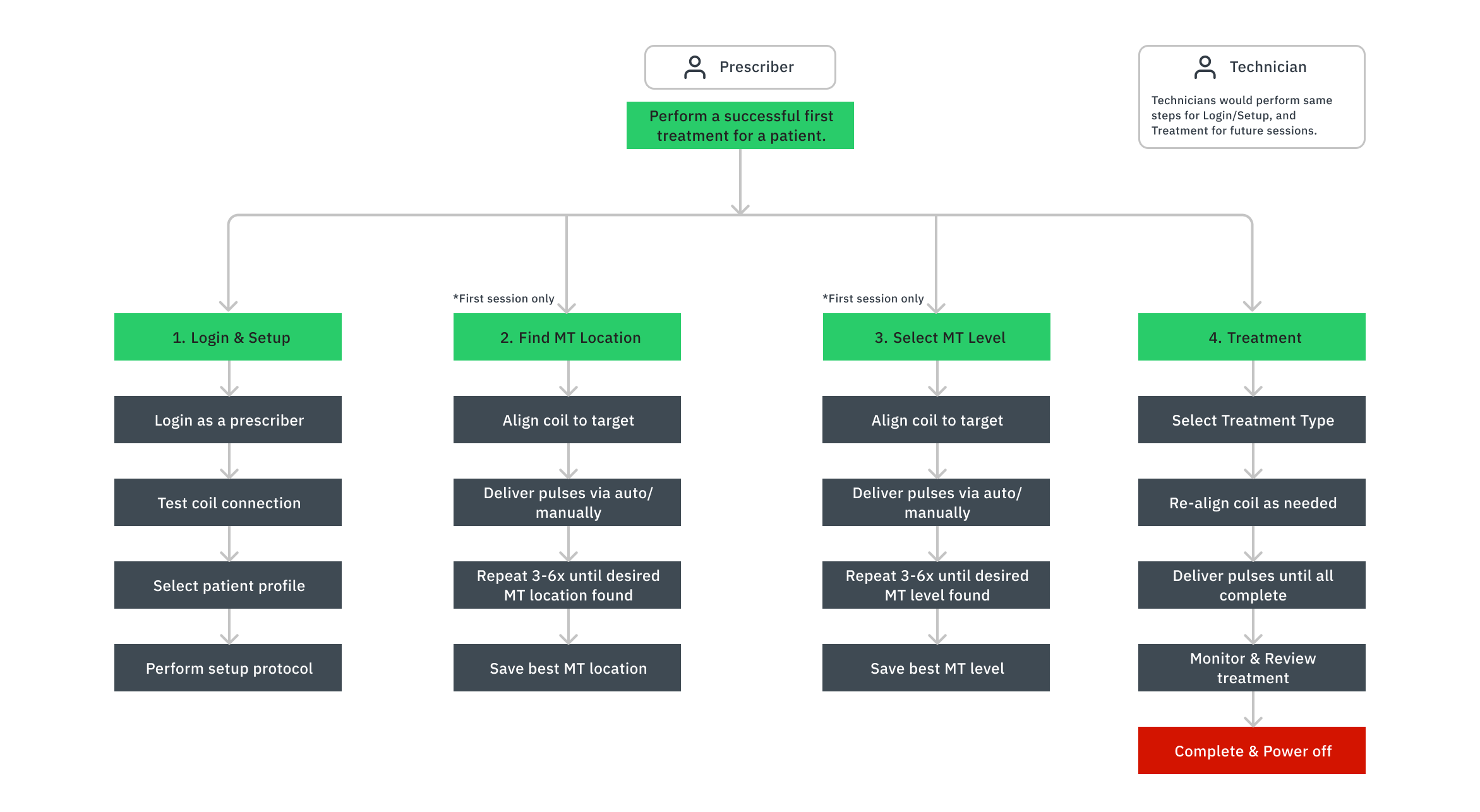
With a hierarchical task analysis, I noted all the essential parts of a successful first treatment. Certain procedures must be performed in a specific order; for instance, treatment cannot begin until the correct location for the coil and the appropriate level of stimulation are identified.
User Types
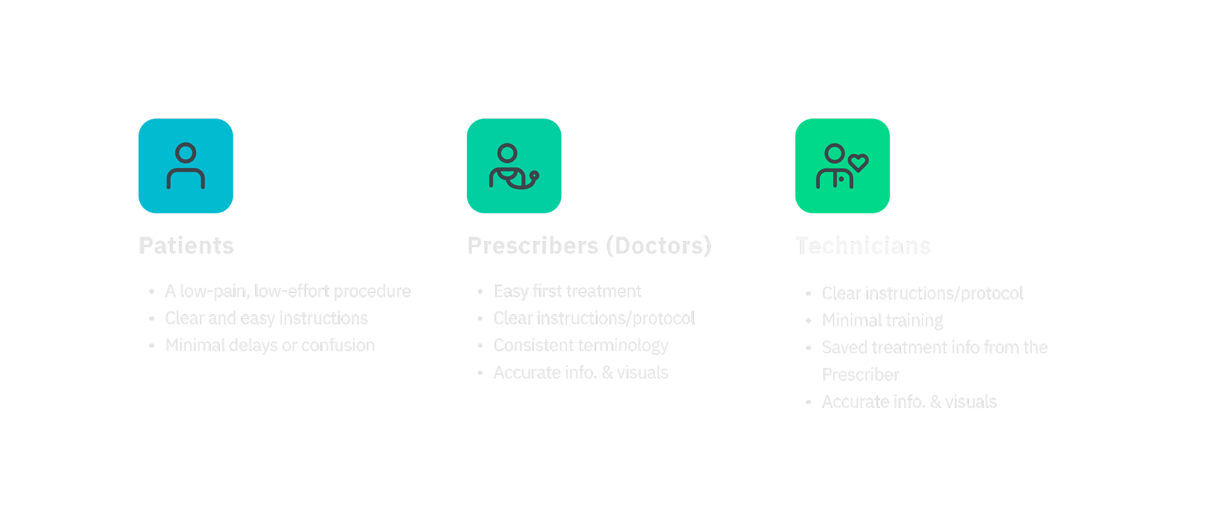
Patients are crucial to understanding the user experience, but they primarily interact with the device by sitting in its chair and waiting during treatment. However, prescribers (doctors) and technicians (licensed nurses) would interact with the interface directly via touch. Prescribers would complete all first-time treatments.
Discovery Findings
Overall, our research gave us a much more holistic view of the device's functionality, treatment procedures, and some of the UI challenges.
The information architecture needed to be reorganized to help intuitively show the treatment process.
Controls needed to follow UX conventions for ease of use and touch.
The user experience needed to provide visual feedback of progress and confirmation when a step is complete.
Ideate phase
Information Architecture - Affinity Maps
By sorting the core features of the device with sticky notes, I identified common characteristics like what was informational, a visual aid, and a control. I also identified which items needed to be displayed together and which could be secondary or tertiary in the experience.
Recommendation: Home Dashboard
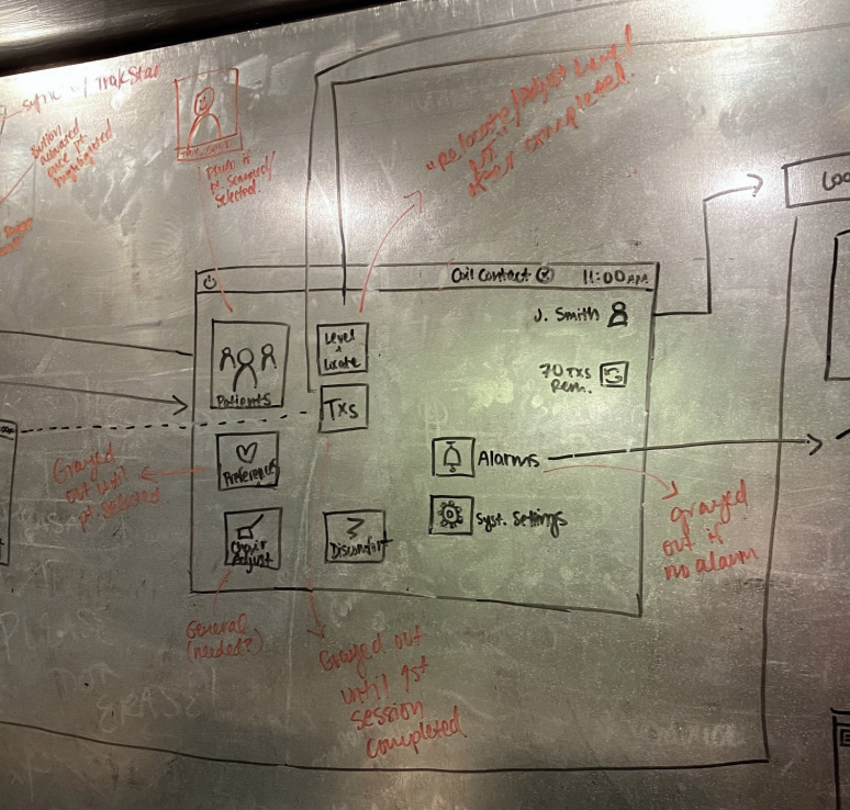
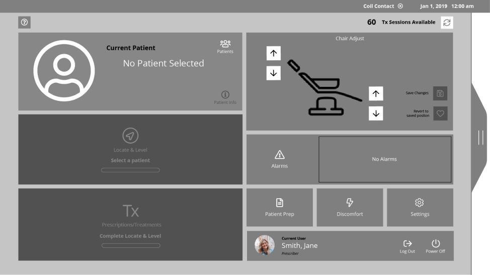
The navigation lacked a home dashboard to launch treatment, monitor progress, and house common controls like chair position. Adding a dashboard could simplify the new technician onboarding process and keep secondary settings out of the way during treatment, but still easy to access.
Sketching
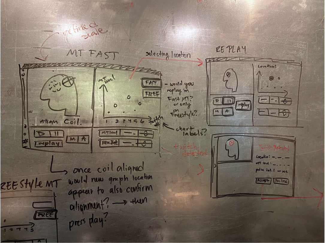
With these groupings in mind, my creative director and I sketched key screens and focused on the proximity of items and their interaction cost. Doing this on a whiteboard allowed for real-time discussion around touch interaction with different controls.
Design Phase
Wireframes
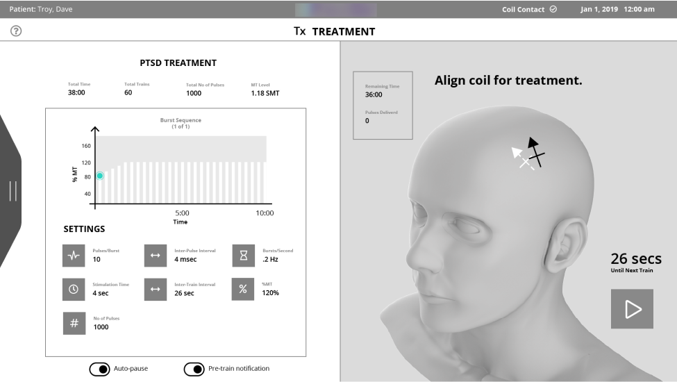
I translated our sketches into low-fidelity wireframes of the home dashboard and treatment workspaces in various states. My goal was to identify placement, scale, and functionality throughout the design. I opted to explore making the home dashboard accessible via a quick-drawer so that it can easily open over the treatment workspace.

User Flows
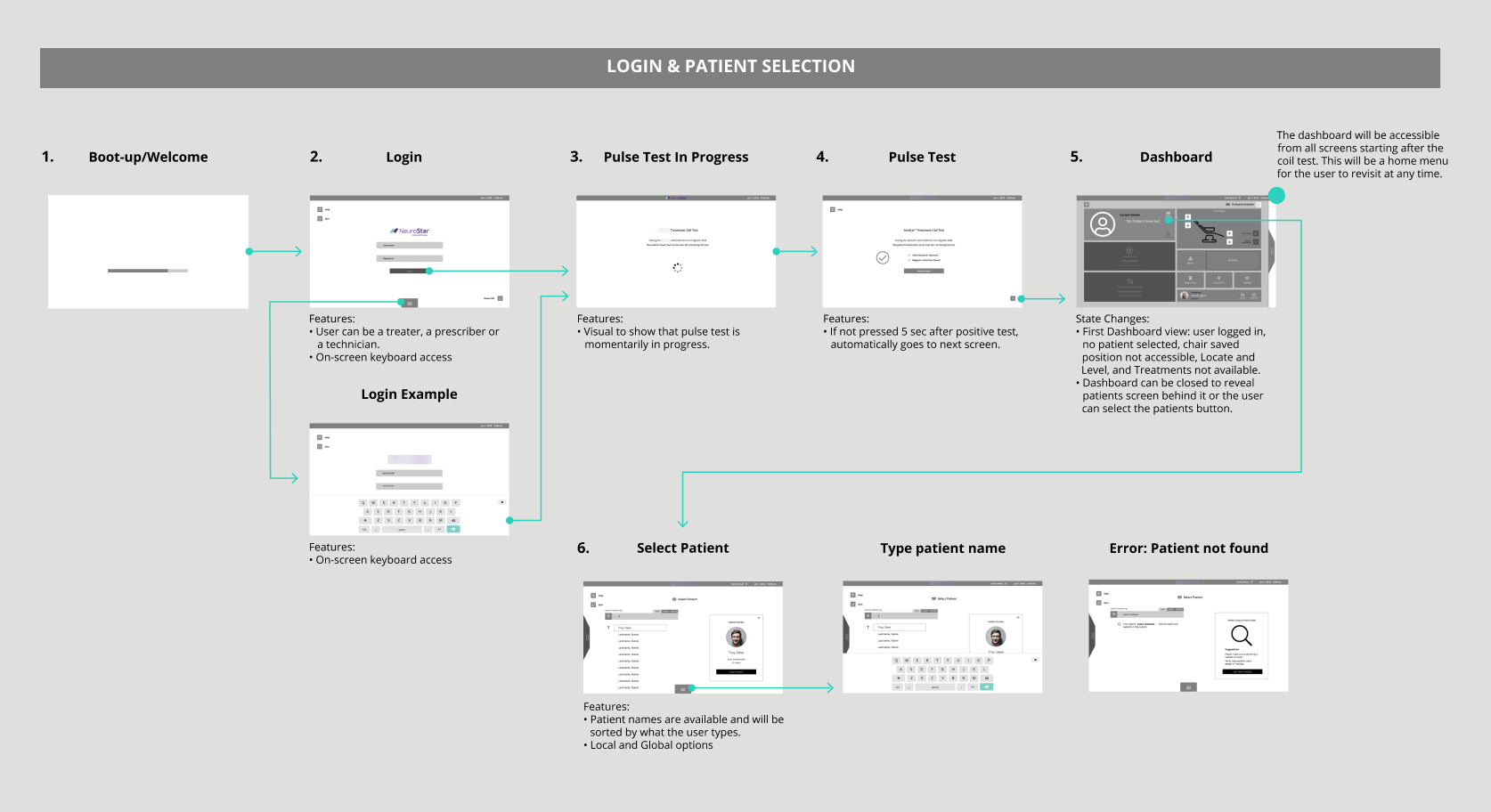
With the most important screens taking shape, I also began to design the user flows; logging in, setting up, locating the treatment "MT" site, selecting the "MT" level, and performing a treatment. Since our knowledge of the device was still growing, we had many check-ins with our client contacts during this phase to ensure accuracy.


User Testing
In collaboration with our client's third-party user research team, we conducted moderated usability testing with technicians and prescribers. During testing, participants reviewed stills of the home and treatment screen wireframes.
1.Home Screen
The home screen was well received; participants noted that it felt like a helpful guide during setup.
2. Navigation
There was some confusion about how to enter and exit the home screen via the drawer tab.
3. Scale
Some elements of the design were too small to interact with or unclear they were tappable. Other parts were too large and distracting, like the visual of the patient's head.
Retrospective refinement
This project unfortunately was paused after this phase due to the client needing to secure more funding.
However, I wanted to explore a high-fidelity, updated design given the user feedback and UX knowledge I’ve gained since. I particularly wanted to improve the navigation, hierarchy, and the design system.
refine phase
Recap of what to improve
Improve the home dashboard navigation
Improve scale and components
Improve hierarchy and move into high-fidelity
Navigation
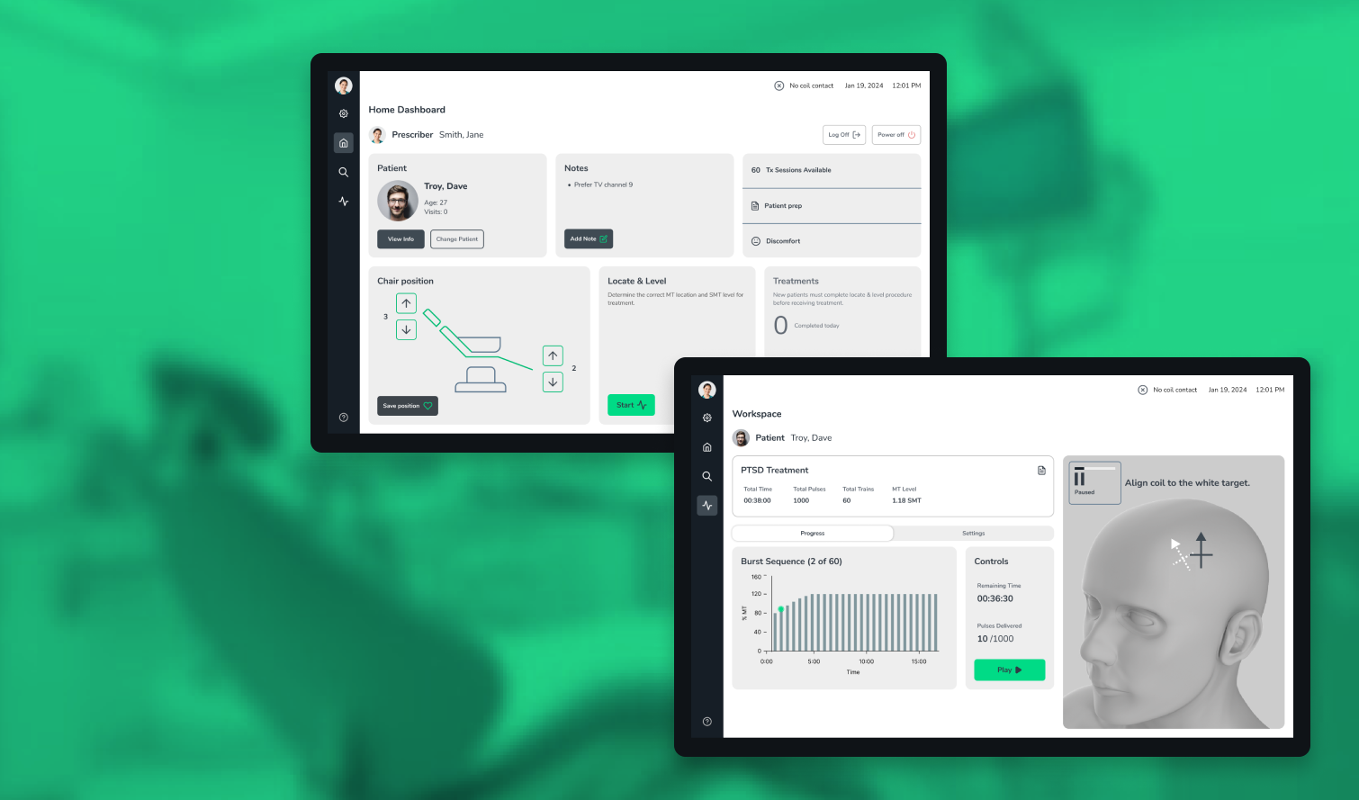
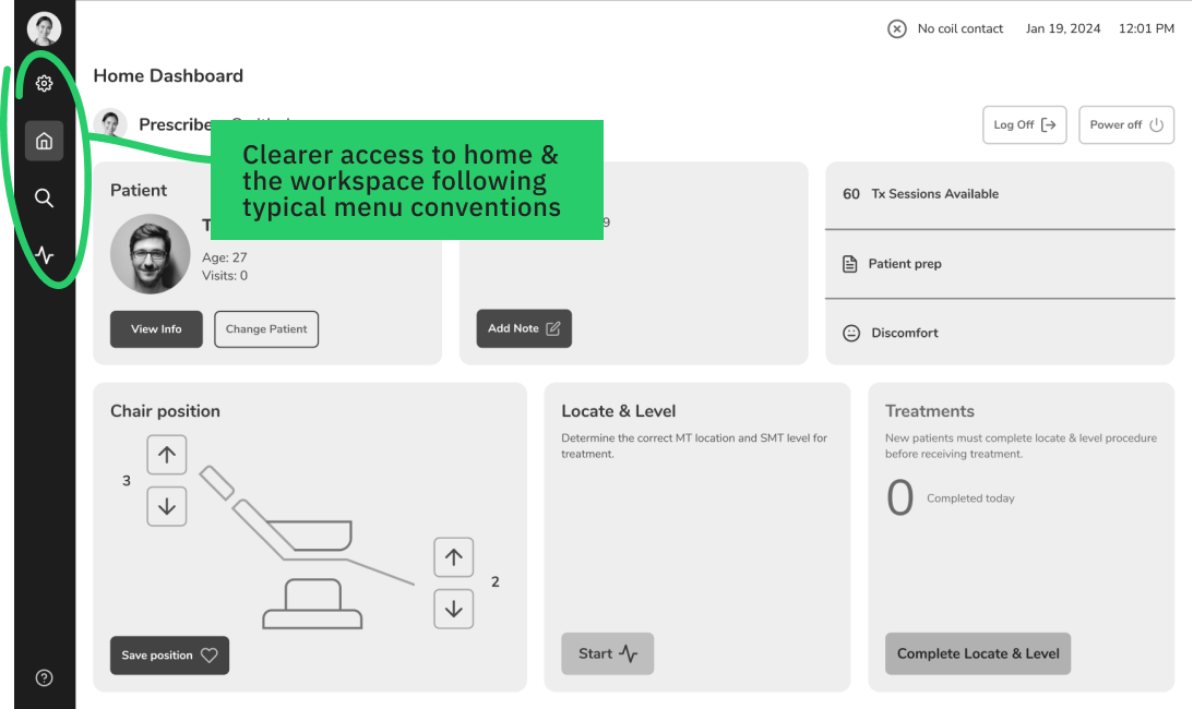
A quick-drawer interaction pattern would usually be appropriate for temporary, contextual controls. Since the home dashboard launches users into the various workflows and is always accessible, it made sense to be a permanent destination.
Eye tracking studies have shown, users look at and scan the left side of the screen 80% of the time.
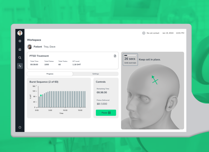
So, I swapped the drawer for a left-side tab navigation that includes the home dash, a patient search page, and a treatment workspace. This layout not only feels clearer to use, but it also adheres to familiar UX conventions for menus and navigation by being positioned in the top left.
Hierarchy
To improve the hierarchy, I rearranged elements on the home dash so that informational items were on the top and treatment-related action items were on the bottom.
Alarms
The alarms also took up a large portion of the original home dash design. However, these are occasional and usually have to be dealt with immediately. Displaying alarm messages in the toolbar and as a pop-over during treatment aligns with standard practices.
Design System
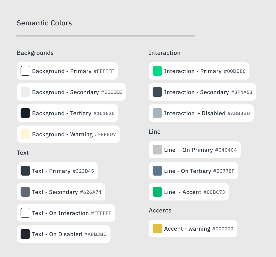
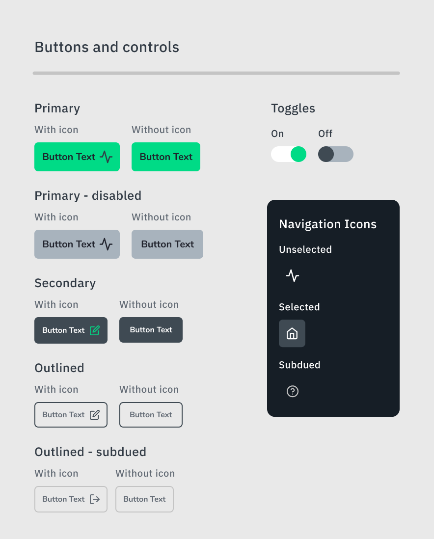
To round out this design, I decided to craft a small design system based on a few base colors and components.
I started with base colors and built out shades and tones. From there, I assigned semantic purposes to key colors like primary, secondary, and tertiary backgrounds.
From there I could start to identify colors for text, lines, and accents. I checked text and background/CTA colors to make sure they were WCAG compliant with a contrast ratio of at least 4.5:1 - 7.1.
To address the scale issues, I took buttons from the original design that tested well and used them as a baseline for the consistent minimum size of any buttons or controls. I streamlined the sizes and created primary, secondary, and outlined styles. This took a bit of refinement between looking at components side-by-side and in the context of the design.
Original UI
New UI
What I learned
Simplify UX with familiar patterns and conventions.
Build wireframes with more standard components to avoid large variations in scale.
Testing with working prototypes yields richer learnings.
I enjoyed this project and would have loved to work on it through implementation. Solving for specific task flows in medical devices poses an interesting challenge, and I am proud to have ended up with a streamlined solution.


